
I guess one of the advantages of getting older (if there is any) is that I am becoming somewhat more patient and I am learning to resist the temptation of trying out on the hardware target every single line of new code I write. I am finding myself using the simulator (MPLAB SIM) more and more every day to test thoroughly sections of my code before throwing it out to the ICD. The result is overall less development cycles (code, program (ICD), run, crash, … repeat), more bugs caught early and more productivity.
The fact is that the simulation allow us to establish a well defined test set up, in essence putting us in control of the entire “universe”, or at least the part of it that our code will see, making it known and, most importantly, repeatable.
In the book I have presented a couple of basic examples of how to use the synchronous stimulus generator to produce the required test inputs and I have used in several instances the Logic Analyzer tool (both are parts of the MPLAB SIM toolset) to visualize the outputs. And visualizing is the key word here. I think you will all agree with me that sometimes a good picture can be worth an entire chapter of words… so the key to a powerful simulation (and more in general the key to effective debugging) is to be able to see your data. And I am not talking just about the Watch window, but way beyond that, using graphs and charts to analyze the outputs of our applications.
One powerful visualization tool – the DMCI – has been added somewhat recently to MPLAB ( in the last year) but I bet it is still known to just a few of you… I wonder if the un-inspiring name of the tool (an acronym that stands for Data Monitor and Control Interface) could be a reason for the little popularity it has achieved so far, despite the great features it offers during the simulation phase (but also during the emulation phase later). The other odd thing about this tool, again a possible turn off for some, is the intimidating, although apparent, complexity of the interface.

As you open the tool window (select Tools->3 DMCI in the MPLAB IDE main menu) you are immediately confronted with a large (unresizable) window split in three (tabbed) panes each containing a gazillion buttons, knobs and sliders. A scary sight for the first time user that is not yet sure about what to do with them. For those that adventure further, clicking on the second pane (Dynamic Data View) the reward is an even busier window containing a large matrix of small boxes begging each to be configured. Only the bravest make it to the third pane (which is my favorite of all) labeled Dynamic Data View, a name that only promises more of the same, but in reality opens up a new world of dynamic graphs and charts.
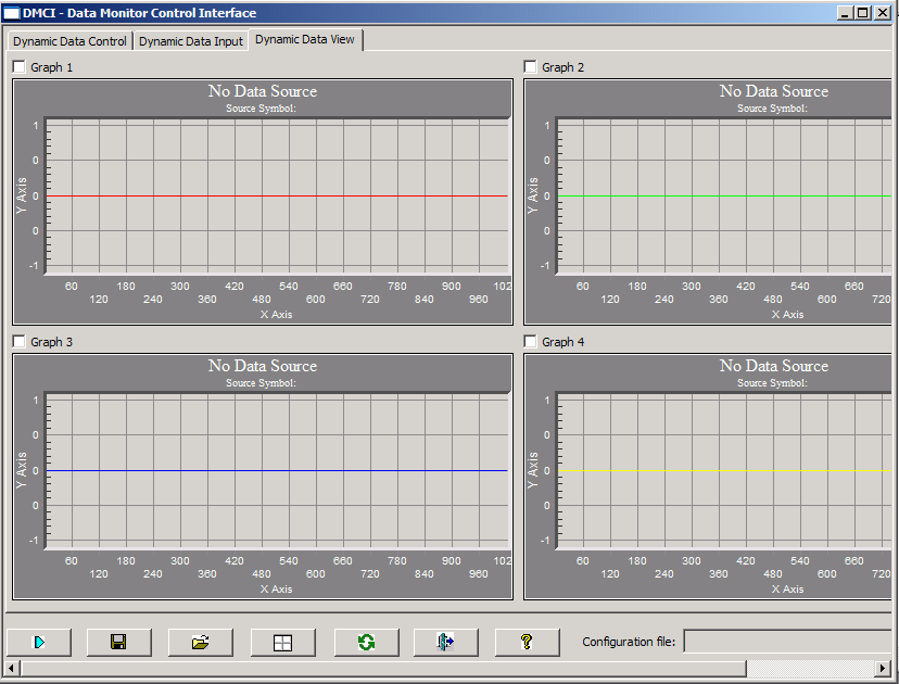
In the best DMCI style, the page is once more intimidatingly filled with (disabled) graphs, no less than 4 of them begging to be configured and used. The good news is that you don’t have to use them all, you can simply select (check the little checkbox) on Graph1 and configure it to use the entire window for himself (simply right click inside the graph area and select from the long context menu the last option “Full Page” view). Notice that there is no “Configure” button on any of the interface elements, rather they all (un-intuitively) rely exclusively on the use of the “right click”, the context menu.
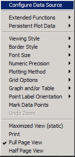
The first item of each context menu is always Configure Data Source, that takes you to the selection of the variable (array) whose contents you want to visualize. Luckily from here things get pretty easy and intuitive, so if you select an array as the data source, you will see the graph to resize automatically to fit the size of the array (x axis) and the type of data (y axis).
Just a few examples of uses for this tool:
- Collecting data from the A/D converter in a buffer, you can now visualize the waveform of the analog signal (this is something the Logic Analyzer could not offer to you)
- If you manipulate the signal (filtering or performing a FFT) you can now see the resulting waveform and signal spectrum
- If an algorithm of yours produces an output control signal, that is not necessarily directly published on the I/O pins where it could be captured by the Logic Analyzer, you can now buffer it (create a simple FIFO) and visualize its behaviour over time…
(to be continued)


